Let’s do a quick breakdown of some Facebook ads!
We’ll break down a Facebook ad and see what’s good or bad, what’s interesting, and what you can take away from them.
Desktop Right Column
Ad Set One
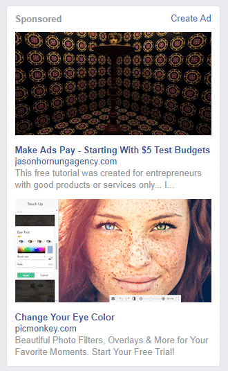
Ad #1
It’s from an agency. The headline is, “Make Ads Pay – Starting With $5 Test Budgets”
The text is cut off towards the end but it reads, “This free tutorial was created for entrepreneurs with good products or services only… I…” There is obviously more to this text. It’s saying that the tutorial is free but the headline says $5 test budget. So what they are advertising isn’t completely free. The image doesn’t really tell me anything regarding the service or the product. I don’t know what ad platform they are talking about. It also gives off a scary vibe which would be the opposite of what I’d want future customers/clients to feel when wanting to learn more. It does pass the Facebook “less than 20% text” image test, I’ll give them that. Ad rating: 3/10.
Ad #2
It grabs my attention simply because it is bright! With a headline, “Change Your Eye Color” I know what the ad wants me to do. I can see the service they’re advertising in action. The text that goes along with it is short, informative, and I can read all of it. Plus, it mentions a deal or offering which in this case is a free trial. It uses emotion to grab your attention by mentioning your “favorite moments.” The ad is clear in what it’s advertising, clear, and concise. This ad rating: 8/10.
Ad Set Two
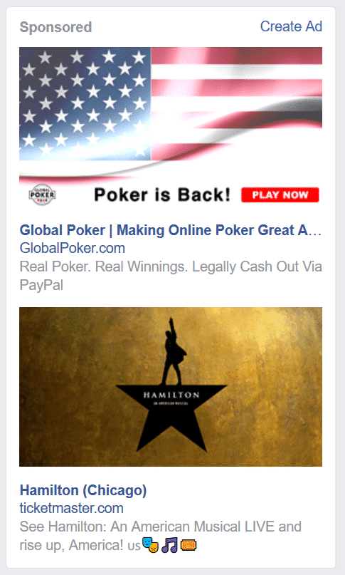
Ad #3
The poker ad’s headline in this format ends in an ellipsis. Again, I don’t know what the rest is going to say but I can take a guess. “Global Poker| Making Online Poker Awesome”
Text is again short, concise, and it lets me know how my future winnings will be cashed out. The image has minimal text which passes the Facebook text. The image doesn’t have anything to do with poker, per se. It’s an American flag and it has no imagery alluding to poker. It needs improvement in headline area as well as the image. Ad rating: 6/10
Ad #4
This sets itself apart by using geo-targeting. The profile that this ad appeared on is listed as living in Chicago. It’s using the location to advertise specifically for profiles in Chicago. They are the ones more likely to head to see Hamilton simply because of the distance between them and the theatre. Hamilton is popular and almost everyone has heard of it at least once. The image has minimal text and it’s the logo for the musical. That logo is also prominent so it can stand on its own. Just like if it was just the Nike or Apple logo. It’s strong enough and conveys enough to be able to stand alone.
The headline is simple and the text fills in any gaps someone might have if they don’t exactly know what Hamilton is. “See Hamilton: An American Musical LIVE and rise up, America! ????????????????????️” There is two issue with the text. The capitalization is all over the place. Some have capitalization while others don’t. It also feels like they felt the need to use the entire space available so they added emojis. It’s not a bad thing but having four in a row at the end just hanging looks a little odd. Ad rating: 7/10
Desktop News Feed
Ad #5
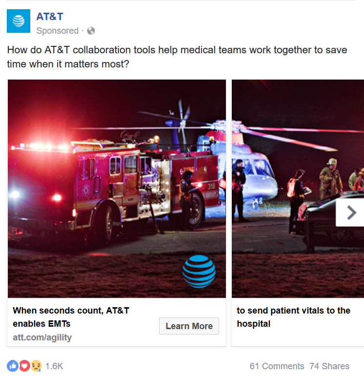
This ad campaign might be my favorite of the entire set. It uses Facebook ad carousel option. You might have seen this format before but for clothing and other products. Everytime you click on the right arrow a new product shows up. ATT&T did something a little different here and I think it pays off really well. They show an accident scene in four different parts. As you click right the story unfolds and you see the entirety of what’s going on. At the bottom of each picture continues the same type of format in sentence form. Each picture caption has a part of the complete sentence. It’s not until you get until the end that you get the full scenario and sentence. Ad rating: 9/10 (always something to improve on!)
There are different ways to create Facebook ads that will generate revenue and catch attention.
If you have any opinions, disagree or agree with any of these Facebook ads, let me know through any of our social channels!
More Perspectives:
How Good Design Can Help Tell Your Organization’s Story