As online shopping keeps becoming more common and social media keeps growing in influence, many marketers are starting to look for ways to maximize the “mobile” era we are currently living in. To this day, 80% of small and medium-sized retailers in the US indicate that email marketing is their greatest driver of both customer acquisition and retention. The next closest channel, social media, comes in at just 44%. There is no doubt that e-mail marketing works, however, you need to do it right to see the results.
As of recent, one of the most important keys to keep in mind when creating a campaign is to ensure that it will be a “mobile friendly” e-mail. About 68% of the time, e-mail campaigns are being opened on a mobile device. You could be harming your engagement and overall results if you are only designing for desktop view. Below are a few tips to help you optimize your e-mail campaigns to be mobile-friendly.
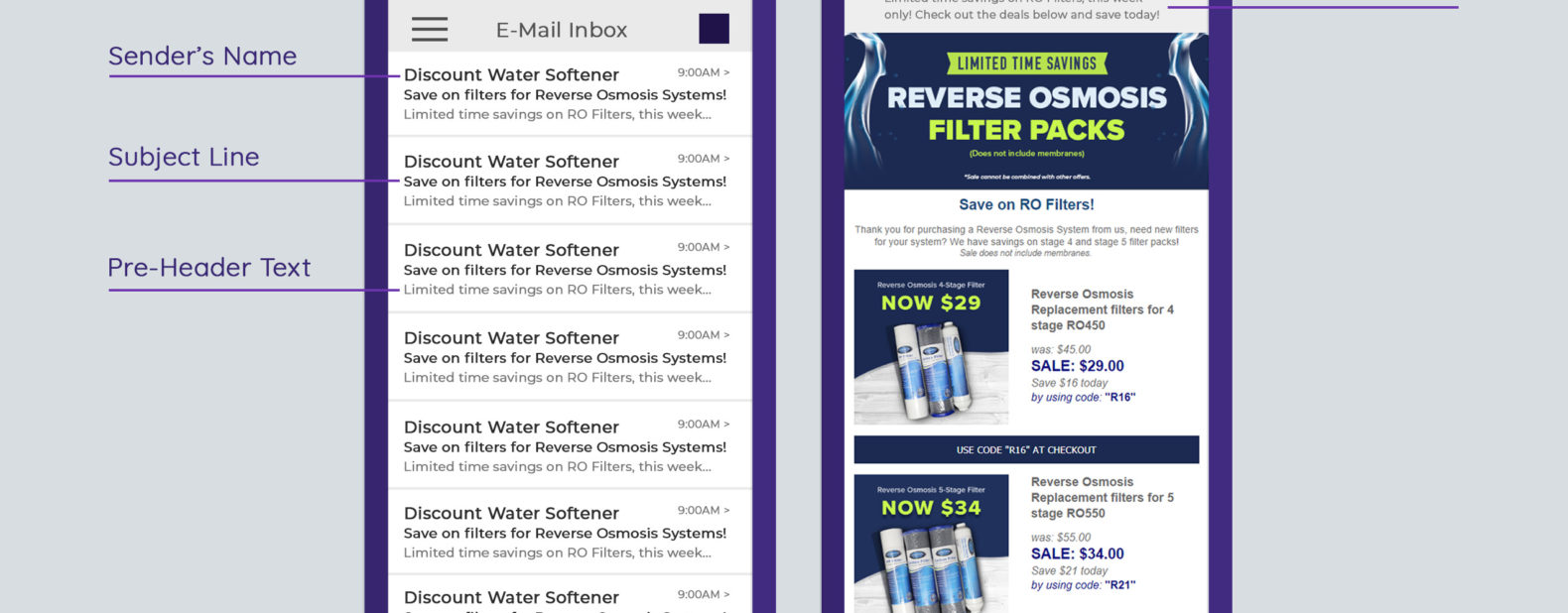
Use Pre-Header Text
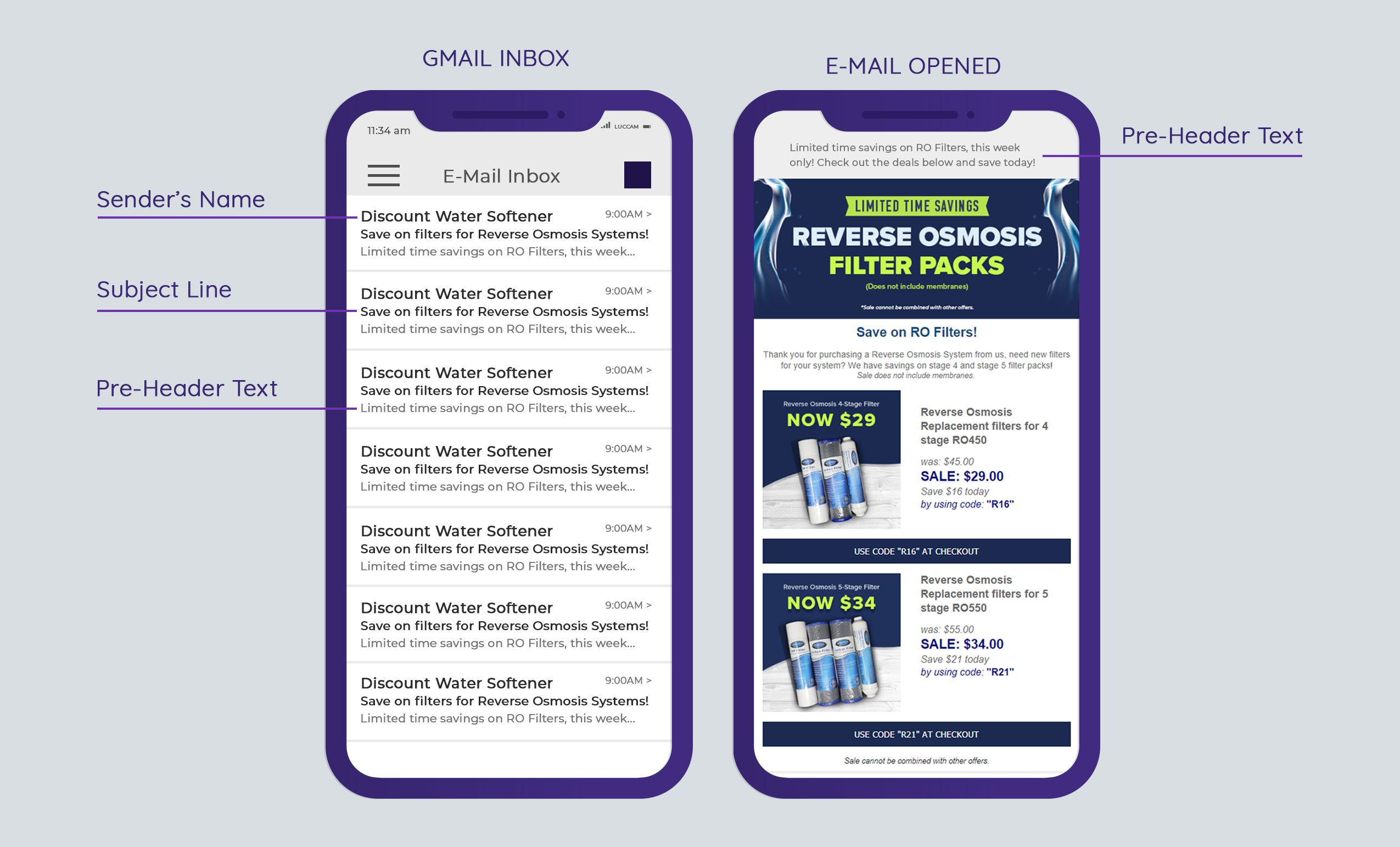
Including pre-header text is one of the most overlooked aspects of creating strong e-mail marketing campaigns. Pre-header text is the first line of copy that’s in your e-mail. It follows and supports your subject line, essentially becoming your first impression. To get the most out of pre-header text, give enticing insight into the content that awaits the reader. This is especially crucial when you are trying to create mobile-friendly e-mails as it provides a decisive preview to the content you want them to see. Since devices, settings, and email client vary, there is no defined set of characters you should stick to. Using pre-header text and combining your message with the subject line is a great strategy to get more people to open and read your e-mail marketing campaigns. Below is an example of a marketing campaign we sent out that used a catchy subject line and supportive pre-header text:
Short Subject Lines
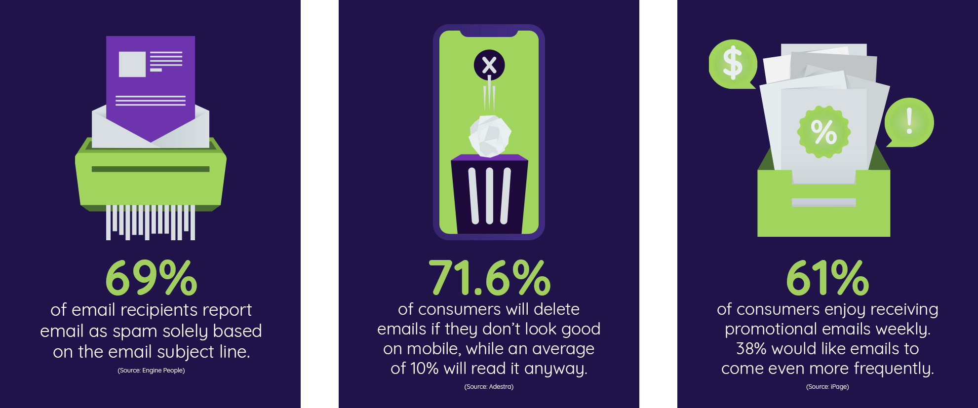
The right subject line can make a reader curious enough to open the e-mail, entice them to read through, and more importantly convert. On the other hand, a poor subject line can make the reader throw your e-mail right into their trash bin. 69% of email recipients report email as spam solely based on the email subject line. Most mobile devices will show between 25-30 characters and 60 characters on desktop view (returnpath). With all of this in mind, it is best practice to keep the length of your subject line short and sweet. Pro tip: add emojis to your subject line to make them stand out in the reader’s inbox and to increase your open rate.
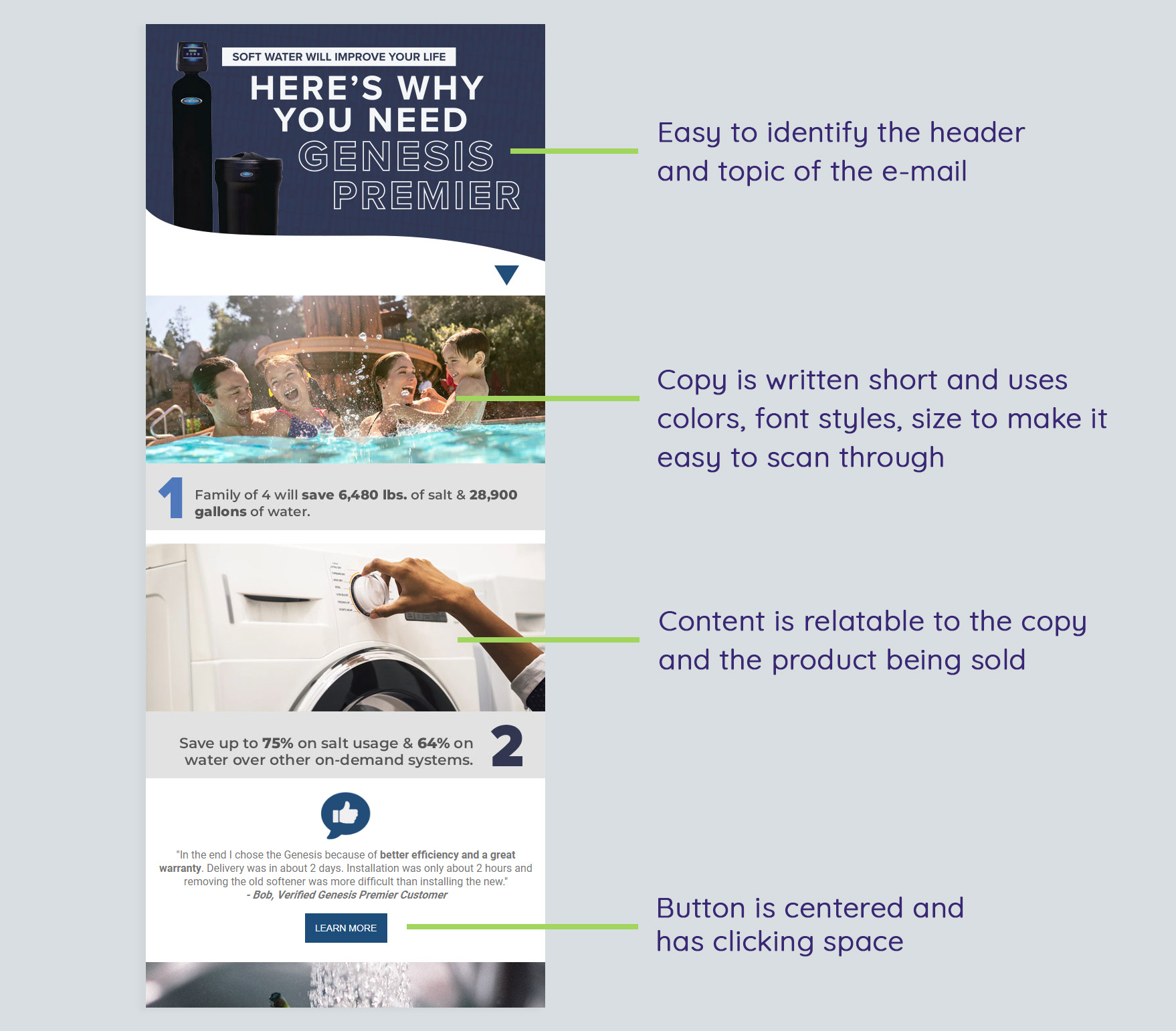
Carefully Plan the Alignment of your E-Mail
Information on the internet is consumed on-the-go. Meaning, people are scrolling through content faster and paying less attention to fine details. To improve the results of your e-mail campaigns, design the layout as well as structure of the e-mail to be quick and easy to read. It is important that you put thought into the alignment of your design. In other words, make sure things are placed and arranged in a way that makes it easy for people to read and engage with your e-mail.
We highly suggest a center-alignment approach as it is the most mobile-friendly experience you can lay out. Since the reader is already scrolling top to bottom, having all your elements (images, text, buttons) aligned will make it easy for them to flow through the e-mail. In addition, having a consistent alignment will make your e-mail look organized and overall more attractive to read. This is key as 71.6% of consumers will delete emails if they don’t look good on mobile. Below is an email we designed to be centered and easy to follow:
Leave Clicking Room
The next factor to consider in your e-mail design is creating space for your elements to “breathe”. E-mails are condensed on mobile view, meaning images, text, links, buttons are tighter and harder to click on. Increase the padding (space) between your sentences to make the body of text an easy read. Leave enough space around your call-to-actions or buttons so that it’s easy to click without accidentally clicking something else. It is never a good idea to have links next or on top of each other. This makes it hard for the reader to click on the action they desire.
If you make any of these a problem for your reader, chances are they’ll get frustrated and abandon your e-mail immediately. Pro tip: create a preview of your e-mail campaign on a mobile device and stretch your arm out to see it with a distance—if it was designed well, you should be able to see the “white space” between your images, text, buttons, and so forth. If it was designed poorly, the elements will look crunched, hard to read, and busy. Here’s an example of good and bad space usage:

Both examples contain the same content and copy. The difference between the two is very clear. By simply adding a “shop” button we were able to quickly guide your eye to the call-to-action and it separated the text to make it easier on the eye. By using two colors, we were able to differentiate the clickable links. This makes it easier for the reader to see and engage. On the contrary, the poor design is too stacked and difficult to read. This also creates a problem with clicking on the links as they are too close. Links that are too close may cause the reader to click the wrong link on accident. We believe in the small details. All of these simple design rules will improve the success, appearance, as well as functionality of your marketing e-mails.
Keep Copy Concise and Use Images Carefully
Not too many enjoy the feeling of opening an e-mail only to find out they must read through paragraphs. In e-mail marketing, copy should not only be concise but also carefully written and placed strategically. As we mentioned before, people are scanning through content and retaining very little. Make it easy for your reader to see your message as well as the action you want them to take. Use bold headings to grab attention and limit the necessary copy you include. Using bullets and/or numbered lists can help breakdown information and make it easy to read through. Mobile devices have small screens, the more text you include the more text they’ll be seeing. The more text they see the more likely it is they’ll ignore your e-mail.
Same goes for images, the more images you include the more scrolling they’ll have to do. Having to continuously swipe to get to the information or call-to-action increases the risk of the reader giving up on reading your email. Be selective with your images, pick only the images that will influence the reader to act. It is important to note that not all readers are able to see images in an e-mail. This is due to their e-mail provider, device, or viewing settings. If your e-mail contains nothing but images, it is very likely that some of your subscribers will not be able to see/read your e-mail at all. Beyond a wasted e-mail, this can cause the reader to unsubscribe or label your e-mail as spam.